
Linguistic Landscape Exhibit
Linguistic Landscapes of the World -
|
|
Shamara BattleKorean Study Abroad
Yonsei University |
 |
“A Step into History”I took this photo at Gyeongbok Palace (경복궁) in Seoul, South Korea. Among the hustle and bustle of city life, lies the Gwanhwamun Gate, which showcases the entrance to the nearly 2000 year old palace. The sign has an amalgamation of languages. Chinese traditional characters, Chinese simplified characters, Korean, and English are all present. The statue itself is an indicator of the official rank for the bureaucrats of the Chosun dynasty. The officials stood next to the statues according to their rank at meetings. The Chinese engravings state “the second rank”. However, the illustration on the sign does not match the words. While in Korea, I sometimes noticed a disconnect between the message conveyed. Though Korean is a language that highly values honorifics, the translation is rather blunt. Instead of directly translating the message as “Please do not step”, a more direct approach is taken with “no stepping”. The image reiterates the constant presence of various languages in Korea. I also find it interesting that the engravings themselves are not translated. Its new designation as a rule marker for tourists somewhat detracts from its initial purpose. The statue has thus transformed into a decoration, rather than holding its original significance. |
|
Taylor BlockIberian Studies (Spain) |
 |
“La Sagrada Família Display Info Panel”This picture showcases an info panel describing the bronze doors at La Sagrada Família, a visually stunning Roman Catholic church designed by Antonio Gaudí, a modernist Catalan architect. The info panel displays a large description at the top in the Catalan language. Underneath is a description in Spanish in a smaller, orange-colored font and a description in English in equally small, white-colored font. While it may seem like a simple info panel, it actually conveys a charged political statement. There is a hierarchy of language occurring. By putting Catalan first and in larger letters, Catalan is marked as the primary language of Barcelona, not Spanish. Spanish and English are included secondarily and more or less equally, apparently only as languages of convenience for the tourists, since La Sagrada Família is a location visited by many people who speak a wide variety of languages. This panel exemplifies the power of visual language as political statement, since in raising Catalan over Spanish, it appears to call for the recognition of Catalonia as a region or nation seeking not only distinction within Spain but also independence from Spain. |
|
Veronica ChuaChinese 211: Intermediate Chinese Abroad I and Summer 2015 |
 |
“The Golden Arches in China"I discovered this McDonald's advertisement right next to my student dormitory in Beijing Normal University. It was promoting the best-selling breakfast items that many Chinese locals regularly grabbed to eat right before heading to school or work. To appeal to local customers, McDonald's strategically adapted and expanded its menu in two specific ways: 1) comprehensively including both American and Chinese meals and 2) seamlessly infusing local ingredients into core Western items. As demonstrated by this advertisement — on the one hand, McDonald's sells the classic American hash brown and sausage/egg/cheese muffin sandwich. On the other hand, McDonald's caters to the local taste by also selling traditional Chinese soy milk, fried dough sticks, and wraps made with oriental spices and sauces. Therefore, this advertisement exhibits how McDonald's has effectively customized what they are selling to fit the cultural preferences of the people they are selling to, a crucial marketing strategy called product localization. In doing so, McDonald's provides the best of both worlds: serving food that suits the established customs and tastes of the local people while still preserving the dining experience of novelty Western cuisine. For this reason, McDonald's has the ability to garner international popularity and achieve exponential growth in countries worldwide. Similar business strategies can be evidenced among other distinguished American fast-food restaurant chains in Asia including Kentucky Fried Chicken (KFC). Simply put, this advertisement illustrates how the progressive rise of business globalization in China has led to striking intersections between Eastern and Western cultures. |
|
Alex DollardGerman Studies Program |
 |
“Our Dishes For Your Wishes”This is an Indian restaurant located on Franz Josefs Kai, a street in Vienna, Austria, which forms part of a 5 km long metropolitan ring known as the Ringstrasse, one of the most culturally significant landmarks in all of Europe. You may note that the sign for this restaurant, with its location in the cultural center of Austria, a German-speaking nation, is in English. “India Gate Restaurant: Our Dishes For Your Wishes” says the sign. A clever rhyme that makes sense and is grammatically sound, but might nonetheless sound somewhat peculiar, even comical, to a native English speaker. We don’t often speak of getting something “for our wishes;” we wish for things. Perhaps someone for whom English was a second language wrote the sign. |
|
Sarah HesseGerman Studies Program in Vienna |
 |
“An Unexpected Austrian Welcome”Upon leaving an American themed burger restaurant in Vienna, Austria, I spotted a hair salon named “Akwaba Rose”. “Akwaba” is the Twi (a Ghanaian language) word for “welcome. As a Ghanaian American in Vienna, I was quite stunned to see a hair salon with an African language in the linguistic landscape. However, it should not be unexpected at all. Refugees from the Middle East and Africa have been fleeing to Vienna for years. However, in 2015 the number of refugees climbed to an all time high. In certain districts of Vienna, the presence of African and Middle Eastern refugees can easily be seen in the linguistic landscape. Through their businesses and presence, refugees make their mark on Vienna. This image is just one sign of how the demographics of Vienna are rapidly changing. |
|
Gurnaj JohalKorean Study Abroad
|
 |
"Globalism"This was taken at a Thai restaurant in Sinchon district in Seoul. Not only did this restaurant, type its menu in Korean and English, it also included unique visual characteristics. Each menu item box incorporates icons at the bottom describing the food in terms of what type of meat, spice level, and stars. Also to the right of the menu are the beverages, which are color coded so even the foreign tourist who does not speak or read Korean can realize what is what and has most questions answered about what drinks they have and what each food contains. This restaurant definitely has an international appeal because it makes an effort to linguistically promote its food by using varied techniques to appeal to both Koreans and an international crowd. Since this restaurant is in the hub of the youth district in Seoul then we can assume that this restaurant is trying to use new and innovate techniques to promote its business and also seem very modern. |
|
Gurnaj JohalKorean Study AbroadYonsei University Korean 273: Understanding Korean Culture and History through Field Trips Summer 2015 |
 |
"Internationalism"The picture was taken at CGV Cinema in the Digital Media City region of Seoul. It is fascinating to see how American influence of naming movie theaters in English in Korea is a common trend: CGV, Moviebox, Lotte Cinema, etc. The movie theaters seem to use English as a way to evoke a sense of internationalism in cuisine and foreign movie imports. The picture above represents this by writing Chili Hotdog Combo in English and trying to translate those exacts sounds into Hangeul, the Korean writing system below. Furthermore, the English writing in Hotdog and Original Popcorn is larger, which might appeal to a more international crowd or just seem more authentic of being western goods. Lastly, it is interesting to note how the popcorn has the adjective words salty and crispy describing the popcorn in English. Thus this may make the foreign food seem more legitimate in quality. |
|
Gurnaj JohalKorean Study Abroad
|
 |
"Prestige"This picture was taken in front of Yonsei University’s Severance Hospital, one of the best hospitals in Korea. The English title on the landscape reveal both Yonsei’s roots in establishment by foreign missionaries as well as possibly the persuasive nature of using English to denote the hospital as rivaling hospitals in the west. This hospital may affect the landscape by allowing both foreigners and Koreans to know where the hospital is if an emergency need arises. Furthermore the severance hospital may linguistically leave an impression for future patients that they will be treated in a place with professionals that have acquired holistic medical education that is competitive at an international level. |
|
Christopher Lam
|
 |
“Degrees of Communication”For our project, we studied the use of multiple languages on certain signs, especially in areas frequented by foreigners. At a fire extinguisher box in a Nanjing hotel, English was used alongside Chinese to account for the fact that many of the guests at this international hotel used English. Given that many tourists also come from Japan and Korea, those languages were also used at sites frequented by tourists such at the Nanjing Massacre Memorial and Zhonghua Gate. It is interesting to note that while many attractions like Zhonghua gate have Chinese, English, Japanese and Korean, the Nanjing Massacre Memorial only has Chinese, English, and Japanese on its descriptions, as in this sign on a wall of victims of the massacre. We theorized that given the role that Japan played in the Nanjing Massacre back in World War II, the designers of the memorial included this language so as to give Japanese visitors the Chinese view of the massacre. It should be noted that the names of the victims on the wall itself are only written in Chinese, which speaks to the fact that the loss of life was specifically Chinese. In summation, one can infer the type of people who frequent or are expected to frequent an area based on the languages used on signages. |
|
Chanell Liu
|
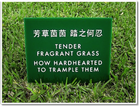 |
“Environment Protection”Although China is extremely polluted, the government and other organizations have begun to put forth extensive regulations in order to protect and better their environment. We can now find signs that encourage environmentally friendly practices almost everywhere as well as recycling bins attached to almost all trashcans. Above you can see signs that are not only very cute but also ask you very nicely and politely to not disturb the environment. |
|
Chanell Liu
Chinese Studies Program in China |
 |
“Cultural Influence”This is a trash can for non-recyclable waste but of all terms they chose to use the term ‘organism.’ Chinese culture is heavily influenced by Daoism and Buddhism in which nature=human life. Therefore, instead of referring to non-recyclable items such as fruit peels and other compostable items as trash, they chose to refer to them as organisms. |
|
Alec NashChinese Studies Program in China |
 |
“Home Away from Home”The phrase 《像家一样的餐厅》doesn’t quite translate to “home away from home,” but the meaning conveys it similar meaning. On this menu, a restaurant proudly announces that it is a “restaurant like home,” or, to English speaking foreigners, a home away from home. The phrase “home away from home” typically does not describe restaurants, but in this restaurant it was certainly not out of place. |
|
Alec NashChinese Studies Program in ChinaChinese 211: Intermediate Chinese Abroad I and Chinese 212: Intermediate Chinese Abroad II Summer 2015 |
 |
“Can Health be Patriotic”Can health be patriotic? This sign about smoking says a lot more about conflicting ideas about the definition of a nation that might be first assumed. Found in the Liyun Hotel on the campus of Beijing Normal University, this sign evokes more than the command to refrain from smoking. |
|
Vy NguyenChinese Studies Program in China |
 |
“Remnants of Tragedy”This sign was found in the Nanjing Massacre Memorial Hall. The memorial hall was constructed in 1985 to commemorate the hundreds of thousands of victims killed by Japanese force in World War II during the Nanjing Massacre. Typically, the signs at historical sites in Nanjing are in Chinese, English, and occasionally Korean. This is one of the few historical sites that has signs in Japanese. By having the signs in Japanese, the memorial hall as well as the people of Nanjing demand Japanese visitors to read, recognize, and understand the damage and horror Japanese troops had inflicted upon their city and their people. |
|
Thomas PartinIberian Studies (Spain) |
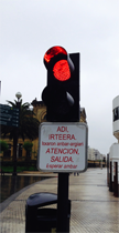 |
“Seemingly Innocuous Traffic Sign”This was a typical vehicle warning sign, found near the seaside boardwalk of San Sebastian. The |
|
Margee QuinnIberian Studies (Spain) |
 |
"Feminism Found on the Streets of Salamanca"These posters were plastered onto the side of a building in Salamanca, Spain, near Barrio del Oeste, a neighborhood known for its artistic flair and alternative vibe. These postings come from two feminist collectives known as Los Rudes d'Avilés and Las Ranas Rebeldes. Both groups work against the machismo and patriarchy that they perceive in Spanish (and possibly global) life. The signs use clichéd romantic phrases (notice the heart shapes) and reshape them or recontextualize them to emphasize alternative understandings of cross-gender relations. So instead of talking about one’s media naranja (“other half” as in half of a relationship, in which one person cannot be complete without the other), one of the signs celebrates the independent woman was a naranja entera or “whole orange”, suggesting that a woman is complete all on her own. Another sign rejects the idea of romantic love with the phrase paso de príncipes azules (“I don’t care about Prince Charmings”). The use of Twitter-style hashtags marks these reformulations visually as expressions of modern, cosmopolitan understandings and taste, more likely to appeal to young women. These apparently lighthearted signs which form part of the everyday linguistic landscape convey quite a lot about political tensions and movement in the contemporary culture of Spain, and intend not only to reflect that reality but to change it. |
|
Aileen RivellIberian Studies (Spain) |
 |
“Dear tourist: don't forget, you're in Basque country”These two signs were found in Zarautz, a town on the northern coast of Spain which considers itself part of the Basque country. This region boasts strong local pride and many Basques have pushed for independence from Spain. The top sign serves as a statement to “remind” tourists of the strong regional – indeed nationalist -- identity of (many) Basques. It makes its target audience explicit by using English and stating “Tourist remember.” The lower sign is in the Basque language and roughly translates to “Eagle is dangerously close, it’s enough! Free Basque country.” The “eagle” represents the Spanish nation and perceived Spanish oppression. Its mention here functions as a call for Basque freedom. The choice of Basque for the message functions as an icon of Basque identity and the Basque independence movement. For tourists who likely do not know what the words translate to, the sign probably functions as little more than a marker of regional authenticity. However, given that few people outside the Basque Country can understand Basque, this strong political statement in Basque also reinforces Basque solidarity by targeting and including primarily Basques and excluding all those who do not understand Basque, especially monolingual Spanish speakers from other parts of Spain who are often perceived or constructed as oppressive “others”. |
|
Irene ShinnGerman Studies Program |
 |
“The Multifaceted Austrian Linguistic Landscape”This digital sign was found in Westbahnhof, a train station located in the heart of Vienna. It is a video-interactive-touch screen directory that shows where platforms and information desks are located. The audio coming from this digital sign was in German but the touch screen allowed people to choose between German, English, French and Italian. Additionally, the video of the woman on top used sign language to direct the hearing impaired. |
|
Sarah WitteIberian Studies (Spain) |
 |
“iPhones and an Independence Movement”This photo was taken on Las Ramblas in Barcelona, Spain in June 2015 when I was there for my final project for SPAN 410. Las Ramblas is one of Barcelona's most popular tourist destinations, and it's famous for its great shopping and street vendors. The main subject of the photo is a billboard advertising Apple's (then new) iPhone 6, and, translated from Catalan, reads "Photographed with an iPhone 6." What struck me the most was the fact that the advertisement was in Catalan and only Catalan and not a mix of Catalan and Castilian. When I was in Barcelona, a lot of the signs were in Catalan with Castilian and English underneath it, a clear nod to Barcelona's urban transplants from outside of Catalonia and tourists alike. But the fact that a large corporation like Apple chose to advertise their most popular product on one of Barcelona's busiest streets in the preferred language of choice of upper class Barcelonans said a lot. They're clearly trying to attract a wealthier clientele, but Apple also could be showing that they understand the independence movement in Catalonia and only chose to use Catalan for this purpose and to not offend any staunch pro-autonomous Catalonia supporters. Despite the fact that it is a very striking advertisement and very well-placed, Apple's language choice shows that they might be trying to maintain Catalonian culture from outside sources in Spain, and to support the independence movement. |
|
Emmy YangIberian Studies (Spain) |
 |
“More than a pizza ad”We found this advertisement at the train station in Zarautz, Spain – a beach town in the Basque Country popular for its surf. It announces a special deal for medium pizzas. The whole ad is written in the Basque language, though many tourists from Spain and around the world pass through this coastal city just 15 kilometers from San Sebastián. The decision to have this ad completely in the Basque language is a deliberate one. The ad includes three symbols of local identity which appeal to the nationalist sentiments of many Basques, who favor independence from Spain politically, culturally and linguistically. These symbols are: a well-known modern sculpture (Chillida’s “Comb of the Wind”), the shield of the historical Basque region of Gipuzkoa, and the Basque language itself. These local/national symbols serve to convert the corporate product (Telepizza is a Spanish national pizza chain) into another symbol of Basque identity and therefore acceptable for consumption by good Basques. Even a simple pizza ad can say worlds about the linguistic and cultural dynamics of a community! |
|
Max ZobermanIberian Studies (Spain) |
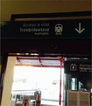 |
“Preference as Protest”This photo was taken immediately after stepping off of the train platform upon arrival in San Sebastian. San Sebastian is located in northern Basque Country just below the French border. It is noted for its preservation of the Basque language and Basque cultural traditions. What’s more, since the late 19th century, and perhaps even more since the later 20th century, there has developed a strong Basque nationalist movement. Basque nationalists argue minimally for the present autonomous status of the Basque Country within Spain, but also many argule and struggle for complete independence. These political tensions play out in visual representation of language. This photo represents an interesting hierarchy within the Basque linguistic landscape, which includes, Basque, the language of Basque national identity, Spanish, the language of the Spanish state and the Spanish national train system (and Spanish national identity), and English, the language of global tourism. The sign indicates the train platform locations in all three of these languages. The language of the Spanish state appears at the top, but just below it – in the “center” of the sign – appears the Basque, which is longer than the Spanish, appears in boldface. English appears at the bottom in a smaller font (albeit in caps). This sign negotiates the demands of the Spanish state (“Spanish is the national language and should appear first”) as well as the demands of the Basque nationalists and the Basque Autonomous Government, who demand a more prominent place for Basque. Indeed, this sign serves as an elegant summary of the linguistic and cultural landscape of San Sebastian in that it generally prioritizes and celebrates the use of traditional Basque language as a form of protest against broader Spanish nationalism and the supremacy of Castilian Spanish, while also attempting to position Basques and the Basque Country within a global order. |
|